Welcome to my Bournemouth project graphs page!
Please read this first!
When talking about this topic, graphics and graphs are going to be very important, especially since a club like Bournemouth who rose so quickly, it helps go inline with the finances and the leagues so here is some graphs detailing on Bournemouths rise to the Premier League and intelligent transfers
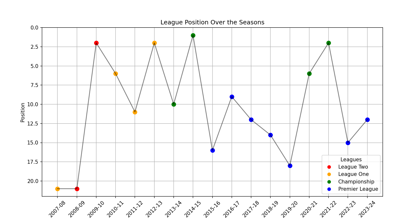
This is a line graph detailing the divisions and league positions Bournemouth found themselves in since 07/08, this shows the rapid rise of Bournemouth and how they solidified themselves as one of the top clubs in the English pyramid
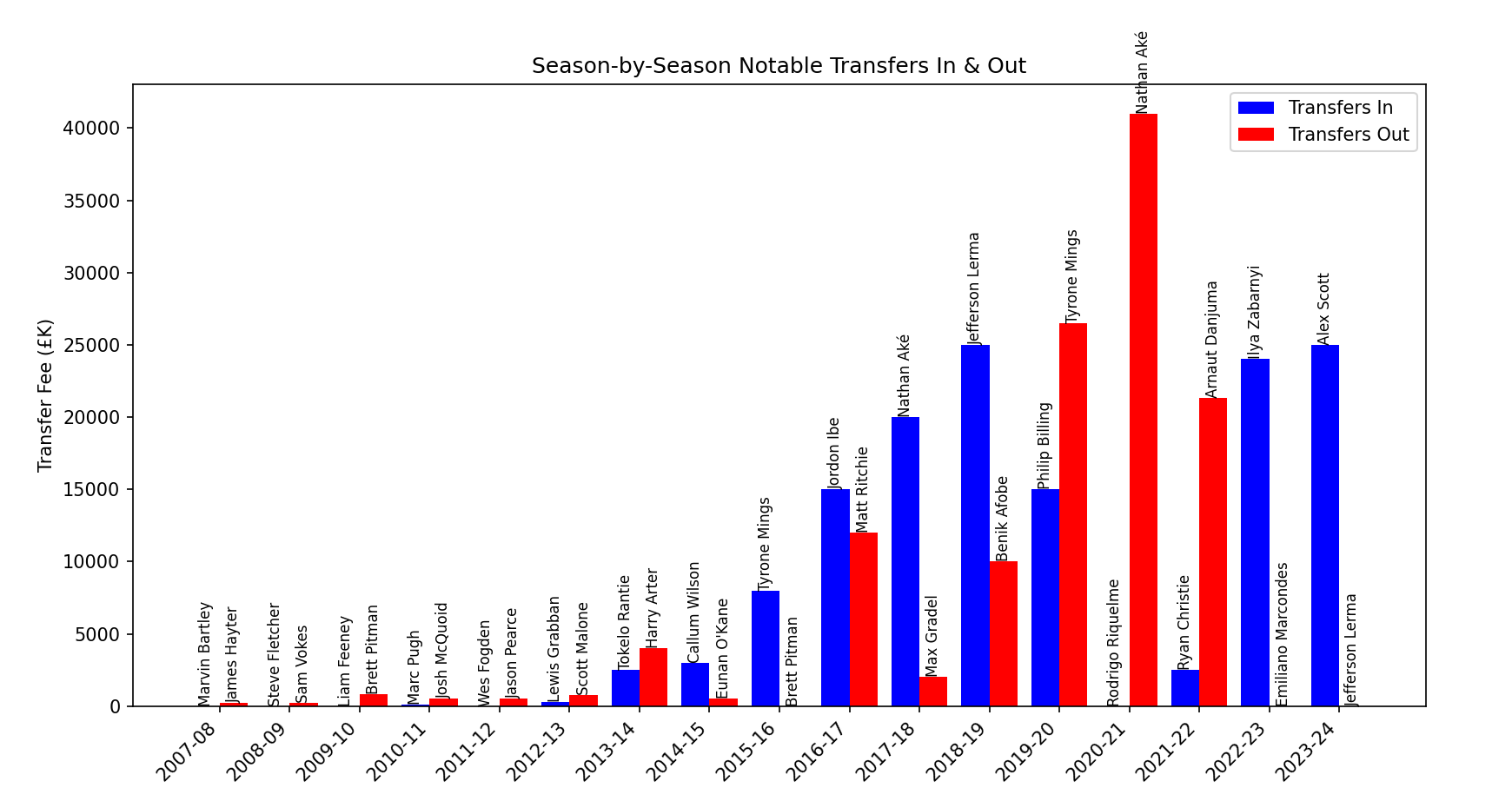
This is a bar chart detailing the transfer spending and selling, we can see that over the years that due to Bournemouths rapid rise, they are able to buy and sell players for more money, this shows how that being a wel run club will give economic benefits even to those who were strugling 18 years ago
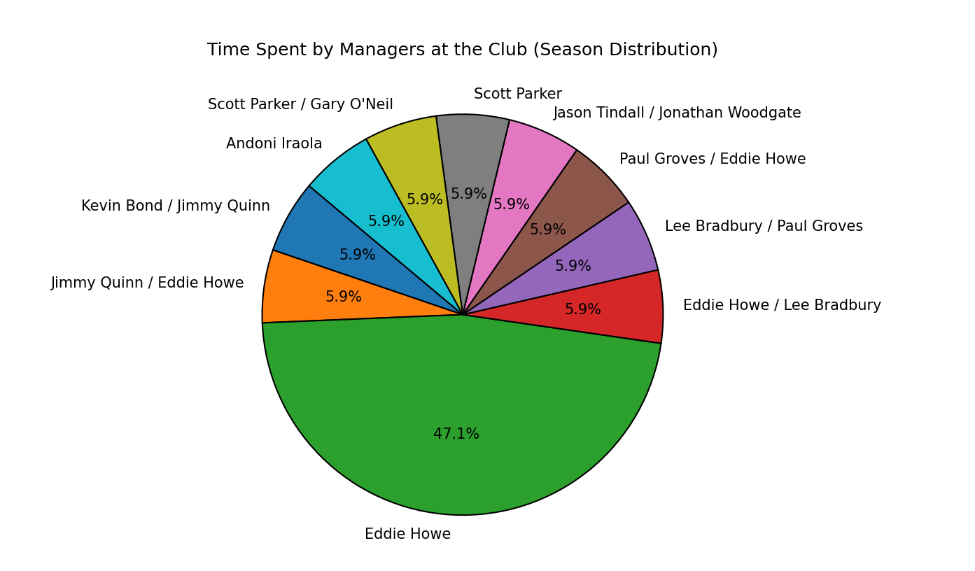
Heres the last graph, it is a pie chart detailing the time that managers spent at the club, as you can see by the graph, Eddie Howe was instrumental to this rise as he spent by far the most time at the club other than a few brief spells away from the club, if you detail the seaosns with the time spent via the code provided on the code page, you would see just how instrumental a coach like Eddie Howe was to Bournemouth